Richard Bruning, 1980s The apex of the DC Comics career of Richard Bruning arrived in 2005 when, after a campaign of 20 years, he finally killed the DC Bullet. Ever since arriving at the publisher for his first tenure as design director in 1985, Bruning had dreamed of the mercy killing. The logo he replaced it with was dubbed the “DC Spin,: and it might have been the best distillation of the ethos Bruning had championed since returning to the company as vice president-creative director nine years earlier. The Spin featured a central “DC” drawn in thick blue gradients and surrounded by a swooshing orbital ring, was everything the old Milton Glaser design was not: flashy instead of monumental; modern instead of timeless; digital instead of analog; and meant to be easily animated for the slate of movie intro sequences DC Entertainment was planning to roll out. In point of fact, it looked a bit like the logo for DC’s then-owner AOL.com, and the similarity was more than just cosmetic: from the moment he returned to DC in 1996, Bruning was on a mission to create the model of a modern digital comic book business. During the years between 1996 and 2010, when Bruning exited DC for the secon...
“Batman doesn’t need to look…like an inflatable balloon.”: DC Comics’ Richard Bruning on an era of mergers, multimedia, and mandatory AOL email
 1 month ago
45
1 month ago
45
Related

Will Smith and DJ Jazzy Jeff’s Origin Story Heads to TV
58 minutes ago
5

Can Superheroes Really Teach Preschoolers to Read?
3 hours ago
4
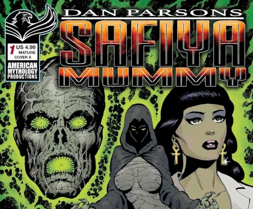
Dan Parsons Safiya Mummy
13 hours ago
11

Inside the Real Dispute Over the Late Dolly Parton’s Estate
19 hours ago
10


Popular
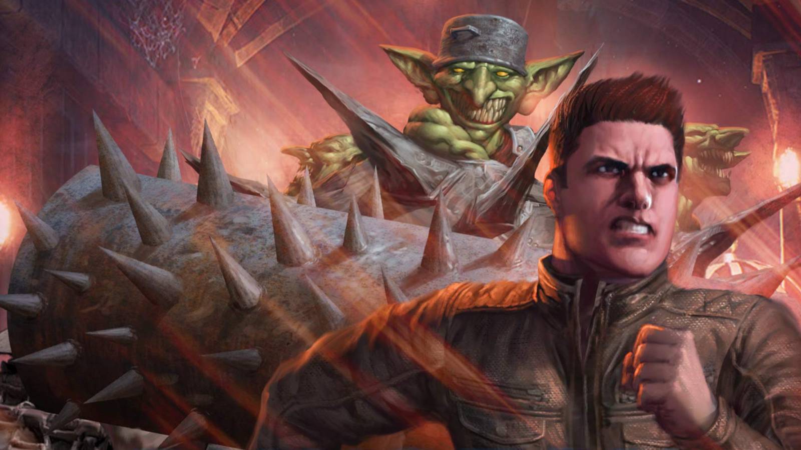
Dungeon Crawler Carl Announces Free Limited-Edition Release
2 weeks ago
119



Power Rangers Confirms Two Fan-Favorite Eras Are Returning
3 weeks ago
87




Prime Video Just Made An Announcement That Takes On Netflix
3 weeks ago
64
 English (US) ·
 © Clint's Comics 2026. All rights are reserved
